
Within the blink of an eye, users quickly decide whether or not they’re going to stay on your website and it begins with the interface, design, colors, and user experience.
Colors & Branding
You are likely stuck with the logo you have, though many companies do logo makeovers with lots of thought and planning.
Does your website align with the emotions you want to evoke? Would the color you want for your website blend well with your logo?
This is a good time to sit down with the brand manager, marketing, and designer to figure out how to improve the experience of your site.
The design and layout of your website requires careful planning and execution since it represents your brand and company as a whole. Many customers are going to a business’ website first to learn about their products, mission, and philosophy.
If your website does not represent your brand personality or is easy to use, customers assume that the company does not care and will get frustrated and leave.
Therefore, similar to designing a well-thought out packaging for a product that consumers will immediately identify with the brand, the way a website looks and functions should also be reflective of and streamline with everything else.
Color Makes Our World Go Round
Assuming your brand has already gone through the grueling process of developing the perfect logo and brand standards, slapping that logo onto your website should look flawless and natural. Depending on the brand personality and industry, choosing the right background color will either encourage people to stay or subconsciously tell them to flee.
Colors are a strong factor in consumers and people in general as they are drawn to color. You don’t go to the store and buy just any color shirt even though each one functions in the same way. You also don’t go to an important meeting with top executives wearing lime green from head to toe. Many people spend weeks deciding on which color to paint their bedroom versus their kitchen.
Likewise, the color of a website evokes emotions, sets moods, and instills feelings in the user. As you browse the internet, keep an eye on what colors each website is and what kind of product or service they are offering. Does it make sense? Does it make you want to stay and learn more or does it strain your nerves to get out?
Subconscious Feelings Associated With Colors
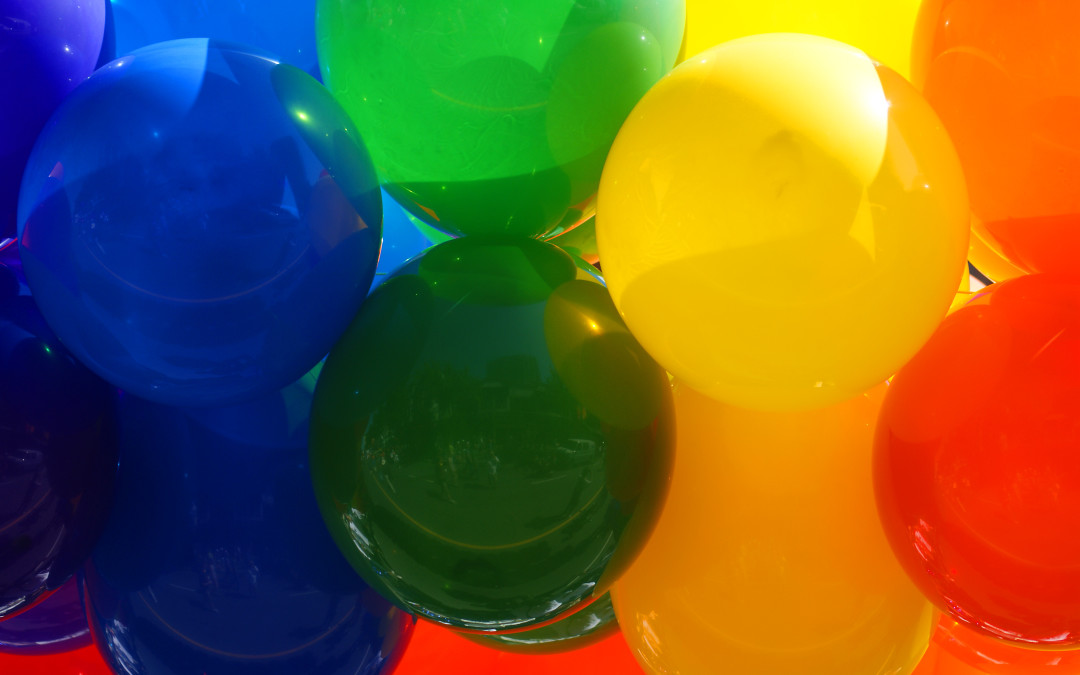
Each color has its own unique symbolism, associations, and mental stimulus. For international sites, it’s important to be aware of cultural norms as certain colors may have negative connotations. Here, we will look at the primary (red, blue, yellow) and secondary (purple, orange, green) colors and discuss the psychology of the colors.
Red

Representing love, passion, and intensity, the color red increases the heart rate while making people hungry. This color instills a sense of urgency, is stimulating, and encourages action.
Examples: food companies, Coca-Cola, Pinterest, American Red Cross
Yellow

This cheerful color strains the eyes while also stimulating mental processes and communication. Its youthfulness inspires optimism and enlightenment.
Examples: McDonalds, Sprint, Shell, Ferrari
Blue

Blue is almost everybody’s “favorite color” and it is mostly associated with water, calm feelings, cold, productivity, trust, and security.
Examples: Lawyers, police, Lowe’s, Ford, Oral B
Orange

This color is exciting, enthusiastic and warm while also symbolizing caution and aggression (not necessarily in a bad way). It can also represent cheerful, friendliness, creativity, energy, and encourage appetite.
Examples: Nickelodeon, BlogSpot, Mozilla, Harley Davidson
Green

Green represents health, earth, tranquility, nature, wealth, and fertility. It improves mood and humans are very sensitive to it since green occupies more space in the color spectrum. It is the second most popular favorite color.
Examples: Eco-friendly companies, Whole Foods, Starbucks, Xbox
Purple

Purple was once a rare color representing royalty, wealth, and success. It is also associated with wisdom, calm, creative, divine, spiritual, and anti-aging.
Examples: Hallmark, Wonka, SyFy, Yahoo, Cadbury
CTAs & Buttons
The color of your call-to-actions and buttons also affects whether or not users will click. Creating the proper colored buttons encourages an action by telling people what to do. There are two types of buttons: Primary and Secondary.
Primary buttons are the ones you want users to click on such as Shop, Buy, Add to Cart, Submit. The color on these buttons should stand out against the background.
With Secondary buttons, these are ones that you don’t really want users to click on but are optional for their use such as Skip, Reset, Cancel, and the color of these blends in more with the background.
Common Phrases
When it comes to what to label your call-to-actions and buttons, it’s best to stick with common phrases like the ones mentioned above because they are quick, simple, and get the point across while also being common and easy to look for.
For companies interested in standing out from the crowd, it’s not a great idea to be testing out your CTAs with uncommon phrases like, “Add Your Opinion” instead of “Submit.”
In general, you want to keep it short and provide a sense of urgency for a benefit. Here are some examples to use:
- You
- Because
- Easy
- Free
- Guaranteed
- New
- Now
- Safe & Effective
- Save
- Today
- Value
With user experience and website design, working with the natural psychological response and mental processes benefits both customers and businesses. Take a look at your site from the perspective of someone visiting for the first time and find out how easy (or hard) it is to navigate around to complete a conversion or if you even want to stay long enough to do that.
You’ll discover that there’s likely a handful of improvements to make in many places and your customers will thank you for the fixes.