Customer Paradigm today launched a new thermo-responsive site. Instead of just responding to the type of device (i.e. mobile, tablet and desktop), we’ve added a new dimension of responsivenes to our site: temperature.
During initial testing, we found a 42% increase in conversion from the thermo-responsive site.
Here’s how our customer-centric, thermo-responsive design works:
- Based on the end user’s IP address, we can determine their geographic location.
- Our database then ties into a real-time temperature feed for their location, and displays a temperature-sensitive version of our site to the end user.
- We’re using the psychological technique of mirroring (see below for more info).
In Cold Weather (Less than 32 F):
Here’s our thermo-responsive site for users that have outside temperatures less than 32 degrees Fahrenheit (0 Degrees Celsius) outside. The goal of this version of the thermo-responsive site is to allow people to know that while it is cold outside, they are warm and safe inside their home or office. (I took this image about 2.5 miles away from our office in Boulder, CO.)

View live version of our thermo-responsive site – Cold Weather version >>
Tropical (Greater than 80 Degrees F):
If the user is in more of a tropical area (i.e. by the beach), the warmer weather version of the thermo-responsive site is automatically displayed to the end user. The dolphins jumping in the water makes the end user feel like our site matches the weather in their area, as well as better matches their desire to cool off and splash around a bit in the water. (I took this image in the Carribean.)
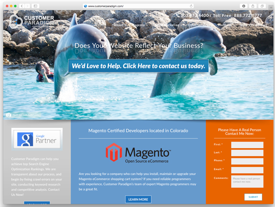
View live version of our thermo-responsive site – Beach Version >>
Temperate (68- 75 Degrees F):
If the user is in a more temperate area (i.e. warm sunny day, but not at the beach), the temperate version of the thermo-responsive site is automatically displayed to the end user, featuring blue skies and green grass. Someone who is feeling good because the sun is shining will see this version of the thermo-responsive site, and have this emotional response reflected back toward them. (I took this image about 2.5 miles away from our office here in Boulder, CO.)
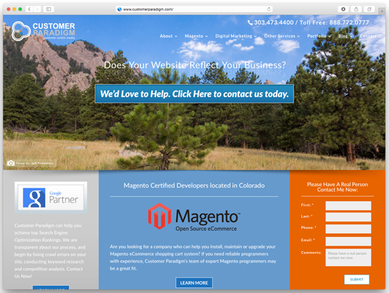
View live version of our thermo-responsive site – Temperate Version >>
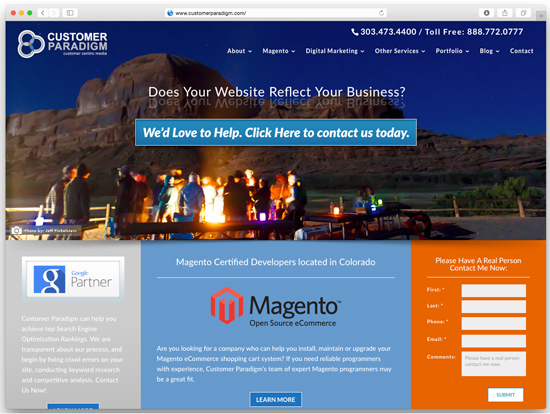
Chilly / Fall Days (55 – 67 Degrees F):
If the user is in a chilly fall temperature area (i.e. you need a light jacket), the crisp fall day version of the site is displayed to the end user, featuring leaves turning colors and reflecting in the water. Fall is a time when the season is changing, and people are becoming more introspective. This version of the thermo-responsive site hooks into this self-reflective emotion and uses psychological mirroring to create trust, empathy and connection. (I took this image at Snow Mountain Ranch, outside Winter Park, CO):

View live version of our thermo-responsive site – Chilly / Fall Version >>
Night Version (33 – 45 Degrees F):
If the user is visiting the site during the night, when the temperature drops, we instead show a long exposure image that features people huddling around a fire pit. This helps convey the sense that our site and our Web design solutions will help keep them warm and happy. (I took this image in Moab, Utah using a tripod last year.)
View live version of our thermo-responsive site – Night Version >>
Lunar Eclipse Version (Not Temperature Dependent):
If the user is visiting the site during a lunar eclipse, then the site automatically will serve them a version of the site that features a full moon lunar eclipse. The reddish glow of the moon is caused by the sun shining through the Earth’s atmosphere and reflecting this light onto the moon. This version of the site did take some extra work, as it needed to tie into a periodic table of lunar eclipse information; it should work properly for the next 3,200 years. (I took this image last April using a 1600 mm lens.)

View live version of our thermo-responsive site – Lunar Eclipse Version >>
Ocean Version (If Geolocation = Out To Sea):
If the user is visiting the site on a boat in the middle of the ocean, we understand that this might be a lonely experience. In this case, we show a scene of a bird flying next to a boat, overlooking the sea. This helps us convey that we, too, know what it is like to travel on a boat at sea, and can view the world from that same perspective. The image was taken on the fourth deck of a ferry, at the same vantage point of the bird. (I took this image in the Pacific Northwest):

View live version of our thermo-responsive site – Out to Sea Version >>
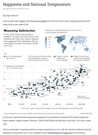 Happiness vs. National Temperature Study
We developed the thermo-responsive technology, based on the University of Rotterdam’s worldwide happiness study during 2000-2010, and found that temperature does, indeed, correlate with happiness.
What Customer Paradigm has done is harness this research and use it to accurately reflect the mood of our end users. We’re using the classic "mirroring" effect in psychology, that uses a technique that mirrors the mood and temperament of the end user, and reflects that feeling back to them. It’s been highly effective in hundreds of psychological studies.
Let me know if you’d like us to help turn your site into a thermo-responsive site.
I hope your April 2016 is off to a fabulous start.
Until next time,

Jeff Finkelstein
Founder, Customer Paradigm
303.473.4400